5 Key Principles of interior design
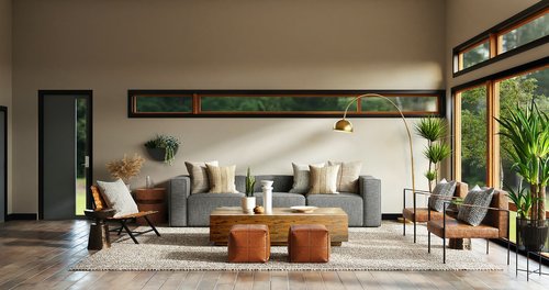
Understanding and implementing interior design principles on your own can be daunting.
Are you trying to replicate aesthetic interiors you have seen on TV or social media but need help knowing where to start? You are in the right place.
By incorporating these five key principles, you can design stunning interiors on par with experts.
Let’s get started!
1. Balance
First up, we have balance. Now, I know what you’re thinking: “I barely have balance in my life; how am I supposed to achieve it in my home decor?” But don’t worry, achieving balance in interior design is more straightforward than in a yoga class (trust me, I’ve tried).
You can achieve the art of equilibrium in 3 simple ways:
- symmetrical arrangement
- Asymmetrical layout
- Radial symmetry
Balance is a key principle of interior design that creates the foundation of an aesthetically pleasing room. Symmetrical balance involves mirroring design elements on both sides of a space, like a bed with two matching bedside tables and lamps.
Asymmetrical balance is more organic and creates balance through visual weight and contrast. Radial symmetry involves arranging elements around a central point, like a chandelier or a statement piece of art.
Forming balance is not only limited to furniture arrangement; there is also texture, pattern, and colour.
2. Harmony
Next,
Achieving harmony in a room is one of the basics of interior design. It ensures that all elements synchronise, creating unity.
Harmony is all about creating a sense of cohesion and flow throughout a space. You can achieve this by repeating design elements like colour, pattern, and texture.
But stay moderate with the repetition, or you might feel like living in a never-ending kaleidoscope.
To achieve harmony, you must also step back and take a holistic view of the space. Ask yourself if all the elements complement each other and work together to create a cohesive vibe.
3. Rhythm
Repetition is one way to create harmony: using the same element more than once. This can be through colour, pattern, or texture.
Each element needs to flow and complement the other to produce a cohesive room; this is part of interior design basics. Buying individual pieces you love is a recipe for disaster.
Nevertheless, contrast is vital. Too much of it can create chaos. However, when the perfect balance is achieved, it adds depth and visual interest.
Attaining rhythm in your design scheme is all about keeping the viewer engaged. You can use colour repetition, shape, texture, or contrast, for example, by having two or three cushions the same colour as your curtains.
Or, if the room has wooden elements, you can repeat that in a wooden vase on a coffee table.
4. Scale and proportion
Now, let’s discuss scale and proportion. Scale refers to the size of objects relative to one another and the space they occupy. Don’t worry; you don’t need a mathematics degree to understand this.
Conversely, proportion is the relationship between an object’s colour, texture, and shape.
The golden ratio (the golden mean) is present in nature and architecture. The golden ratio can create harmony, balance, and beauty. It can be part of your room layout principles. The figure is around 1.618; the ratio is about 60/40.
Interior designers have additionally separated the ratio into 60/30/10. A good rule of thumb is to aim for the golden ratio, which is roughly 1.618. This ratio can create a sense of harmony, balance, and beauty in a space.
But if math isn’t your thing, remember that you want to avoid creating a space that feels too cluttered or sparse.
Scale is the size of an object concerning other items or the room. Proportion is the relationship between an object’s colour, texture and shape.
In terms of furnishings, that would be 60% sofa and rug. Less than that would make the room feel sparse. Over 60% would feel cluttered.
30% side chairs and coffee table. 10% decorative pieces like cushions or artwork.
5. Emphasis
The last key principle of interior design we have emphasis. Emphasis is on creating a focal point in space, which draws the eye and adds visual interest.
It could be a statement piece of furniture, a bold accent wall, or artwork. Whatever you choose, arrange your furnishings to highlight and draw attention to the focal point.
Emphasis is the technique of drawing attention to a focal point within a space.
Whatever you choose as your focal point, the placement of your furnishings can highlight the focal point.
Examples of this are fireplaces, art, statement furniture or accent walls.
Wrap up
So there you have it, the five key principles of interior design. I know what you’re thinking: “That sounds great, but where do I begin?”
Well, fear not, my friend, because the beauty of interior design is that it’s all about self-expression. Don’t be afraid to experiment and try new things. Play with colour, mix patterns, and have fun with it! After all, your home should reflect your personality and style.
But if you’re still feeling overwhelmed, don’t worry. Plenty of resources are out there to help you on your interior design journey.
There’s something for everyone, from design blogs (a.k.a. Housliy) to online courses. And with some practice and inspiration, you might become the next Kelly Hoppen.
Principles of interior design help transform any part of your home. Feel free to give it a go and implement these principles. You may be surprised at what you can achieve.
So go forth and design, my fellow home decor enthusiast. The world (or at least your living room) is your oyster! I’d love to hear from you! Comment below.


2 Comments
Comments are closed.